B1C2
Quotation marks are dead
Quotation marks are awful punctuation.
Take the simplest possible type of quote:
"Let's go for a walk," he said.
What he actually said was:
Let's go for a walk.
The period in the speaker's sentence turns to a comma inside the quotation mark. I hate this. It drives me nuts.
The situation deteriorates rapidly for even slightly more complicated cases.
"Let's go for a walk?" he asked.
The part inside the quotes is a complete sentence, and yet the "he" is in lowercase as if the sentence didn't just end.
What if two people talk for a long time? For most lines of dialogue, the "he said" and "she said" tags at the end can be omitted, but once in a while (how often? ¯\_(ツ)_/¯) the tags need to be added so the readers are reminded who is saying what.
What if one person talks for a long time? The closing quote can be omitted, but each new dialogue paragraph still needs to begin with an open quote.
Not to mention, my code editor uses straight quote marks (""), my text editor uses curly quote marks (“”), and if I ever translate my book into French, I'll need to use chevrons (« »).
We don't need to live like this.
Long live quotation marks
I wanted to write this book without quotation marks.
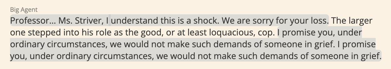
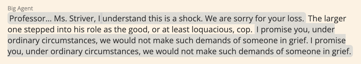
My original idea, shown above, outlined the dialogue text in different colors. Each character was associated with a different color. This had many issues:
- Not all colors were visible. For example, the above color is a dark blue, but shows up as a blurry black. Below is another example where the yellow outline didn't show up clearly on the sepia background.
- The different colors were too distracting. As I write this book, I've been very conscious of the fact that there is a thin line between "effects" and "Captain Underpants for adults." This felt a little too much like a flip-o-rama.
- It was getting hard to come up with a different color for each character where all the colors didn't clash with each other or blend together.
- My editor didn't like it and I trust his judgment.
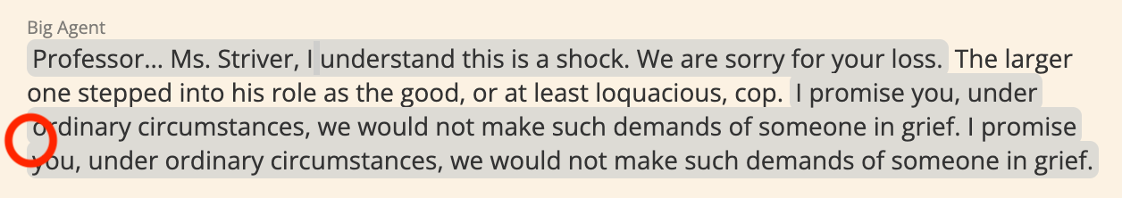
I went for a walk and came up with a new idea: speech bubbles.
Actually, this is a pretty old idea, which is one of its advantages. People are already used to speech bubbles, from comics, and more importantly, from text messages. Some UX designer at Apple was probably paid ten million dollars for figuring out people like speech bubbles for text messages. I'm not going to second guess him, and after all, what is dialogue but a text message inside a book?
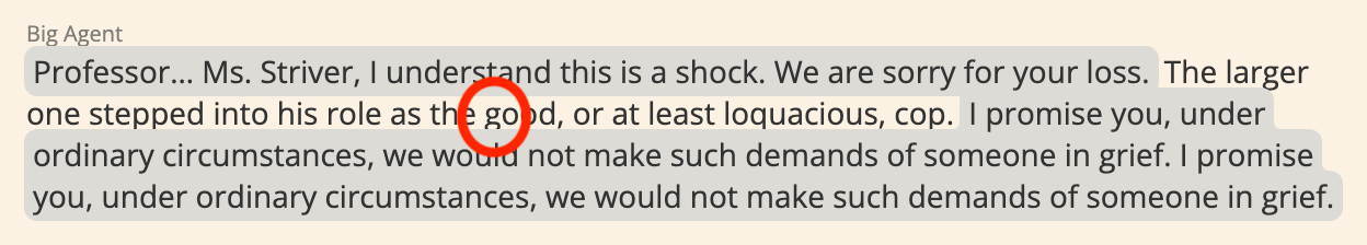
box-decoration-break feature that lets me add the padding to each line. The next issue: there is a little divot on the left and I want a straight line. (CSS is a code language that changes how websites look.) 
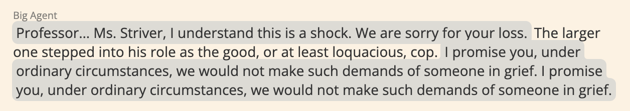

I'm pretty pleased with this.
One of the big advantages of publishing on a website is that I have the freedom to do things like this. In a book, using speech bubbles like this would be a nightmare:
- Standard typesetting software doesn't make this easy
- It would require a lot of ink to print
- The formatting would get mangled in ebooks
- I would need to get permission from more than five different people to be allowed to do this
On a website, this is really easy to do, and makes the final result a lot more pleasing to my eyes.
Automat
Speaking of things that are pleasing to the eyes...
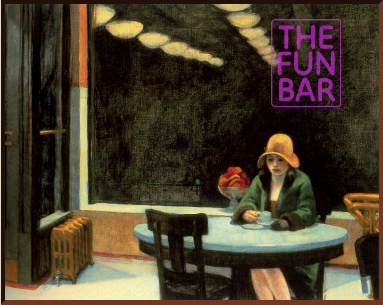
I love this painting so much. (Technically it appeared in the previous chapter, not this one, but that one's post was too long already.)
The painting is Automat by Edward Hopper. Hopper is best known for his other painting of someone drinking alone on a moody night...
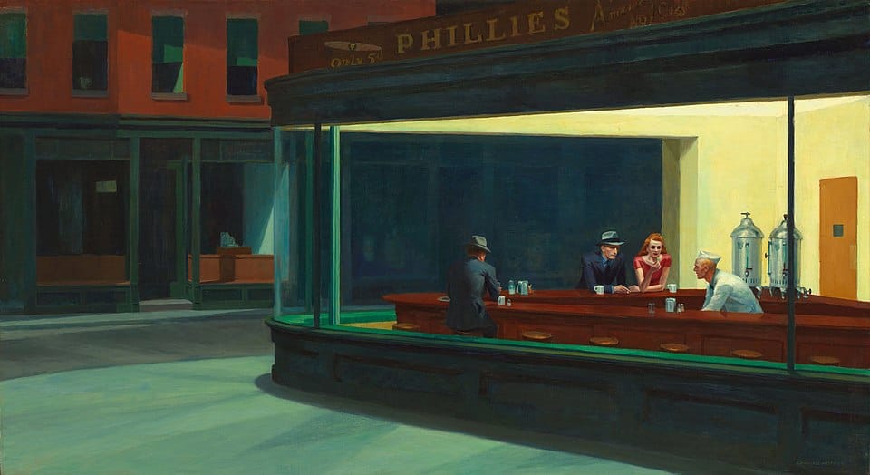
When I was writing the previous chapter, I was thinking about Nighthawks as a sort of mood board for what Clay drinking in the bar felt like. After I was done writing, I read Hopper's Wikipedia article as a distraction, and whaddya know, I learned about Automat (1927), which is an even better fit for this story. This painting fits so well because:
- The automat of the title refers to a dining establishment where the process of serving food has been automated, typically with vending machines. This ties so nicely into the AI-mediated mass unemployment of my story.
- The girl in the painting is, for better and for worse, a sign of her times. For better, she is out alone at night safely, she doesn't have to wear pantyhose, and she has enough money to treat herself to a drink. For worse, she is alone and seems conflicted. The combination of material riches and emotional poverty again ties nicely into my story.
- At this point, I was determined to shove this painting into my story. I would probably have done it through an allusion to "a painting of a girl drinking" instead of a literal image file, except that this painting has a huge black negative space that was too tempting not to deface with a neon sign. It's giving history repeating as farce.