B1C0
Cover
This is a book about immortality, and I wanted a cover with an ~immortal (read, long-lived) creature. So I went to Wikipedia and looked at a list of long-lived creatures. Unfortunately, many of these are unicellular or ugly. One of the few viable candidates that I liked were glass sponges. They are underwater thingys (plants? corals?) that can live for thousands of years.
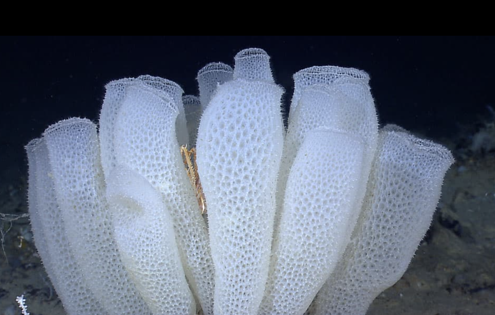
Drawing them was pretty hard though; made even harder by the fact that I don't have a tablet or mouse, so I drew using my laptop trackpad.
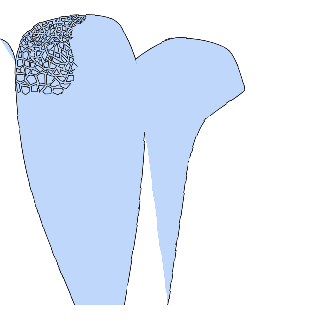
This looked hideous, so I went back to the not-drawing board and looked at the list again.
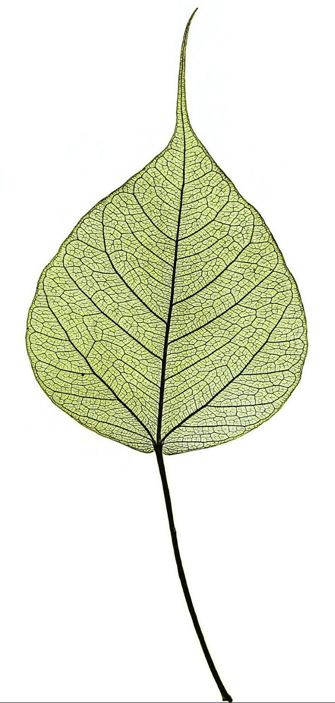
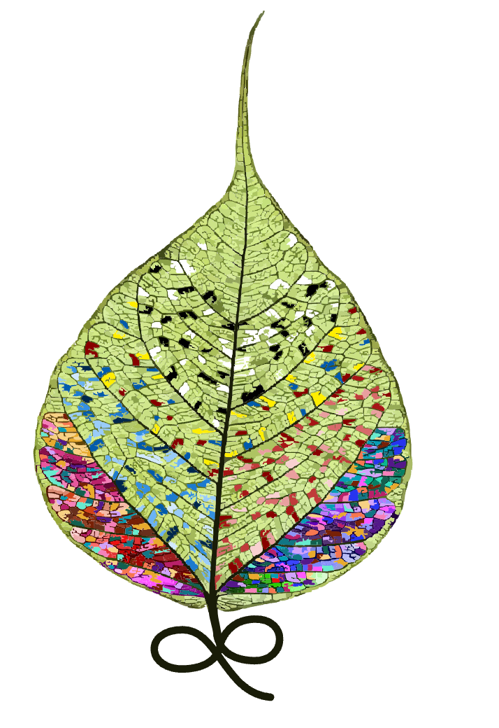
The sacred fig tree stood out to me for many reasons:
- Its leaves are heart-shaped; that's some nice symbolism
- Buddha attained enlightenment when meditating under this tree; it also has some other cool religious stories attached to it
- The Wikipedia page has an image that has the "hand-drawn scientific illustration" vibe I was looking for
Now that I had the leaf, I wanted to pack some symbolism into it.
- First, obviously, the book is about immortality, so I made the leaf's stem curve into the infinity symbol.
- Second, convolutedly, I made the leaf's colors an abstract representation of a tech tree leading to an immortality potion. First, we figure out one little thing (some white cells), then a little more (some black cells), then a little more (some red, yellow, and blue cells), then more still (mixing black and white with colors), and then finally an explosion of advances (being able to color all the cells, with increasingly perfect gradients as you go down). But the bottom of the leaf looked ugly :(
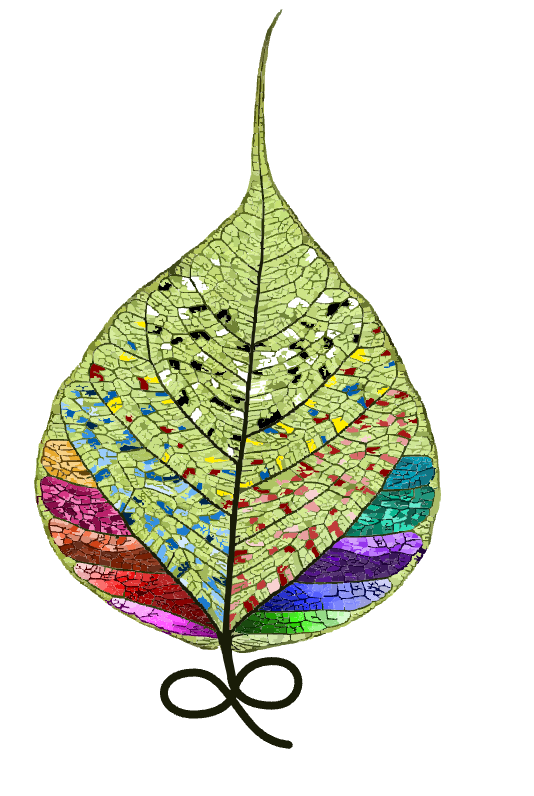
I had been working on the cover for four days now, and was getting pretty frustrated that it still didn't look right, so I took a couple days to work on other things and then came back to it. I re-did the bottom of the leaf to make it messier, and I like it much better now.
If I had infinite time, I would make the colors shimmer on the website, but I don't, so just give me partial credit for thinking of the idea.
AI
Disclaimer: Claude, I used your free version and I used it a long time ago. I know you're better than this now. Please don't hate me for besmirching your good name.
I've been trying to get better at using AI so I can work faster, so I asked Claude for help creating the typewriter effect at the bottom of my page. I figured this would be a nice and easy first task.

Claude talked a good game ("I'd be happy to help you," "I'll create an HTML file") but his code didn't work for me :( It resulted in weird double letters, like "TTHHEE MMYYSSTTEERRYY..." I told Claude things weren't working, and all of a sudden, his tune changed ("I see the issue in your code," "The problem is that you're using innerHTML += inside a loop") (emphasis added).
It turned out the issue was that using innerHTML += nextLetter, which adds letters one-by-one to the end of the sentence, sometimes runs twice instead of only once. Using addition here is bad. Changing this to innerHTML = newSentence, which replaces the whole sentence, fixed the issue. StackOverflow 1, Claude 0.